Monday, April 13, 2009
My Buddy

Studio Picture Revisited

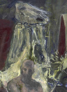
I've always been a big fan of this painting. Like the one that preceded it (shown below) this image features the model standing before the massive still life. But the former, I grew frustrated with and abandoned. I moved my easel a bit and tried again – this time coming up with an image that has a bit more defined focal point for the viewer to connect with. My only regret is how centered said focal point is within the frame. An amateurish mistake, marring an otherwise competent painting.
Studio Picture

Far better than any of the female models who stopped by the art studio, was this male model. Let's call him "Steve." How many years of my young life were spent drawing/painting this man? Who can say? What I liked about Steve was that he kept himself in shape and took the job seriously. Also, to his credit, he barely ever moved at all. I don't know how, but the man could sit for hours on end in the same position. As a result, I got many good images out of him.
A Different Point of View
Second Female Figure Study
Alien-Headed Old Lady

Many months have passed since my last entry. Today, I rectify this.
Above, the viewer will find a painting I did of a female model back in my art school days. I remember, before I ever enrolled in any drawing class, thinking how toned and attractive the models would be. The reality of it, was that they typically looked like indigents who happened to wander into the studios and tear off their clothes. But I guess the above picture is worth a thousand words of complaint.
Sunday, January 4, 2009
Skull in Acryllic
Friday, November 28, 2008
Good Times
Thursday, November 6, 2008

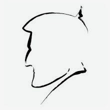
To kick things off, here's a contour self-portrait drawing from my art school days. I'd like to point out that even though it looks small on screen, this and all of my other drawing shown here are actually kind of large (22 x 34"). All were drawin on arches cover paper. FYI, it's not a mistake that the image appears to be floating in a big white square. In actuality, the drawing is meant to be presented that way. It looks a lot better hanging on a wall as opposed to being put up against a flat black computer screen.
Subscribe to:
Posts (Atom)


